
With more people starting to use their mobile devices, such as smartphones, iPad and other tablets, for nearly all tasks, there is one thing that is crystal clear: smartphone surfing is gradually overtaking internet surfing. Also, it is not only surfing — people are using their mobile devices for everything from checking emails and browsing various social media outlets to doing online shopping.
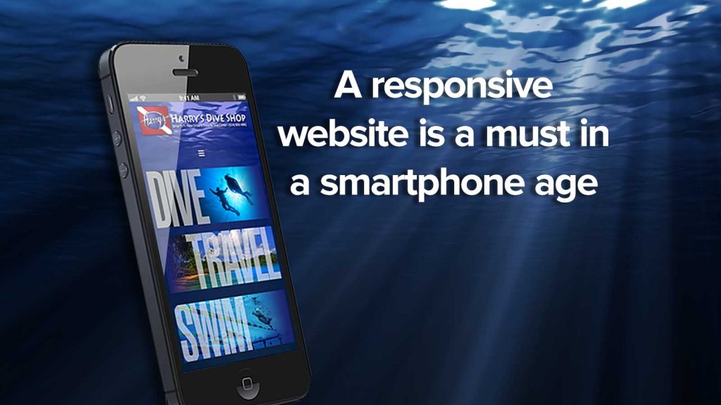
As mobile usage is growing rapidly, it is very important that your corporate website be responsive and mobile friendly. Although you can have two websites each dedicated to desktop and mobile users, there is an effective design that is capable of handling both kinds of internet users. This design is known as responsive web design.
It is a very simple concept; a responsive website design means a site has been designed and developed so that its entire content, including structure and images remains exactly the same on all devices. Put differently, if your website has a responsive design, you will not need to concern yourself with having separate websites for different devices or continually ensuring that your website runs smoothly on a mobile platform.
You just need to step outside to notice that a majority of people are attached at their hip when it comes to smartphones and mobile devices. Google statistics clearly indicate that mobile usage has skyrocketed in the recent past. For example:
- More than half of all Google searches are done from mobile devices.
- Sixty percent of website traffic now comes from mobile devices.
- Over half of all emails are opened on smartphones.
Moreover, Google prefers a responsive website design. This is because it is more efficient for the search giant to bot crawl a website and also organize and index all the online content. In addition, when there is only a single URL and website, it is a lot easier for users to engage, share, and interact with all the online content as opposed to a website with separate pages for desktop and mobile users.
Apart from a variety of search benefits and making your users or potential customers happy, responsive website design can considerably increase your conversion rates from nearly all smartphone users throughout the globe. This is because if your site isn’t working well on tablets or phones, users will not be able to convert. This is extremely important as a majority of internet users are doing their online shopping using mobile devices.
According to a recent research study, nearly seventy percent of total mobile users shopped using their smartphone within the last thirty days. Moreover, with the advent of WordPress designing and developing a responsive website is not all that difficult.
Finally, with a responsive website design you can do some vital high-end A/B testing (comparing two separate versions of the same web page to determine which performs better) and heatmapping (geographical representation of data). This could be done via software such as Optimizely or Clicktale. This will allow your business to segment current users by mobile, letting you get a better idea of the way these users are interacting with your website.